Ages ago (in internet time), I've added a "Music Player" widget on most of my blogs. It's quite obvious as (at that time) I've turn on autoplay, though I've turned it off when I was sick of hearing the same songs. I don't know when it was, but I've quietly stopped using it when the music host (imeem) decided to reduce songs/playlist outside the site itself to 30-sec samples. Since I've disabled auto-play, I kind of forgotten about it, which is kind of good if I'm already listening to my own music when suddenly the song plays and it becomes annoying.
As recent as 8 December 2009, 12 days from this post (might be 11 because of time differences), imeem was bought by MySpace Music and entering the imeem.com URL would redirect to there, with apparently no way to transfer account/music over, including official accounts.
This means that all imeem players I've embeed would be removed, including its code. If it's in an account that I've abandoned for quite a long time (eg. Friendster), it's most likely those won't be removed as I don't even use those accounts anymore. Links to my imeem account would be removed, though they might have already been replaced by a link to my Twitter profile earlier in the year.
Sunday, December 20, 2009
Music Player removed
Thursday, November 12, 2009
Anime Blog URL & Watchlist Updates
The anime blog url has been changed from asuna888-en.blogspot.com to taksiru.blogspot.com
Entering the old url, would lead you to the new address, but a link to a particular post might not work now. The theme has also changed to match the japanese version.
My anime watchlist sidebar widget had some minor changes to display the episode titles. Images has also been changed from 100px*75px to 100px*100px, though might change again to 100px*125px due to the episode titles. The minimun height for each entry, however, remains at
the original height of 60px.
Saturday, October 31, 2009
Meanings behind my Twitter lists
At my Twitter page, you would notice that I have created lists of grouping people. If you look at it, you might not understand what they mean. Here are the lists:
- kagakugijutsu (科学技術): Science and Technology
- t1-: People from the United States of America and Canada.
- t4-: People from Europe, including the United Kingdom
- t5-: People from Latin America, including Mexico
- t6-: People from Southeast Asia, Australia, and New Zealand
- t27: People from South Africa
- t81: People from Japan
- em2a: People who talk about Anime. The name is spelt backwards, with the "ni" (に) changed to "2"
- podcast: Owns podcasts that I follow.
- crs-gmi: Backward spelling of "img src" (image source). Owns sites with interesting info that I regularly visit, not necessarily images.
PS. The layouts of the anime blogs has changed again, but with both English and Japanese version having completely different themes. The former is based on the technology blog, but using the background and colour scheme of the previous, while the latter was unchanged, but changed the background, font and with minor changes to the colour scheme.
Saturday, October 24, 2009
Navigation of Stories Changed


Story 2 Part 19 (middle link) is the worse as it's filled with navigation and notes and none of the actual story actually appearing there, though ironically, it has been fixed several days before Google's cache of that link.
The old navigation links looked something line:
[revised on 25 November 2008]
(continued from part 18)
(related: "Tokihi (Part 8)")
[Author's note: ...]
insert story text here
(to be continued in part 20)
That's why it appears in the snippets and search engine's summary as the notes occupy the top. Here's the newer format of the above:
This newer format cleans up the mess at the top. Links at the middle would lead to related parts, what chapter this is part of at my Wordpress blog, and so on. More importantly, the actual content of the post is visible in snippets and search results.
insert story text here
← Part 18
Related: "Disoriented Feelings (Part 8)"
Part 20 →
[Author's note: ....]
[Revised: 16 February 2009]
Due to an unexpected large amounts of parts I have done, changes will only be done when I decided to make changes to the post itself which is quite random or of my favorites, so you might see a mix of the old and new ones.
Of course, I don't change them blindly: I fixed broken/wrong links along the way. I was aware that in Story 4 Part 2, the link pointing to the continuing part actually points to the previous part. Also, Story 3 has already been renamed from "Tokihi" to "Disoriented Feelings" somewhere in June/July this year.
Ps. My anime blog layout theme looks awful when compared to the technology blog. It's ironic that I designed both of them.
Tuesday, October 13, 2009
Avatar changed
Image at the top right of the navigation menu has been changed from  to
to  . In addition, the dimensions of viewable area has been changed from 65px*73px to 55px*55px so that it doesn't take up too much space, but will be vertically expanded automatically if the area left of it contain my feeds from Twitter. These images are based on my vectors numbered v0080 and v0088 respectively.
I have also changed the avatar image at twitter. Between the previous (Senjouhara Hitagi; from Bakemonogatari) and the current one (crop of v0088), I had been using the source image of it shortly before I decided to make a vector of it. However, when uploading the finished vector, I noticed that there is no image appearing in all the browsers, including those that has not been used for weeks. In its place was a broken image icon (blank or hover-over text as normal text in the case of Firefox) where the image supposed to be. I thought it's just me until someone pointed out (from the other side of the globe) that they are seeing the same problem.
The problem has now been fixed. Do note that the background is transparent.
Saturday, October 3, 2009
Slight changes to Anime Watch List
Left: Japanese version
Right: English version
Thumbnails has been changed from 60px*60px to 100px*75px. As a result, you can see more details. You might see it cropped in the table (eg. 90px*60px), but the same source image is used.
For the Japanese version, additional coding has been added to make it resemble the logo. Example: "生徒会の一存" has been changed to "生徒会の一存", but due to language reasons, I can't do the same for non-Japanese versions like how do I do "超電磁砲" (Chou Denjin Hou; note the first character) if it's supposed to be pronounced as "Railgun"? Unless there's an official logo in, say, English (which is not likely to appear until after the Japanese broadcast has ended),it's going to look strange.
For technical reasons, I also can't do outline around the text. The closest thing I could do is to have a background or a drop-down effect.
Oh, another oddness you might have noticed in the Japanese version for episode numberings instead of the usual "第2話": Umineko 12 is numbered as "III-I", K-On! 12 (2nd last ep) as "最終回", "第拾壹話" for Bakemonogatari 11, or "#08" and so on. It's based on the numbering shown in the episode itself at the same time as the episode title. On the English version, or if those numberings are not given and is not a special episode, I would follow the numbers that places like wikipeia are using. Anime like "Fullmetal Alchemist" do give the actual numberings along with the title like "第16話「戦友の足跡」"
For reasons not mentioned, Bakemonogatari seems to be using a lot of the old characters (旧字体/舊字體) and fraud-proof (eg. legal documents, cheques) versions for numbers. Also, text that should have been in hiragana are written in their katakana or (obsolete/rarely used) kanji forms. Like "有難ウ御座イマス" instead of "ありがとうございます".
Sunday, September 27, 2009
[Drawings Blog] Change of post layout
New posts on the drawings blog now have a new way to be presented. This comes less than a week after the new layout for song lyrics (finalized draft), though I haven't added colours for that.
The new layout has the sub-header at the side instead of the top and the following text corrected:
- Comment: This was drawn on a notebook. → *This was drawn in a notebook.
- コメント:メモ帳でこの絵をしました。 → ※このスケッチをノートに描かれた。
- Pencil → Pencil Sketch
- 鉛筆 → 鉛筆画
- 鉛筆(編集された)→ 鉛筆画 (編集)
- ベクトル(最初) → ベクトル (初期)
- バックグラウンドなし → 無背景
- アウトライン → 輪郭線
- Original Image → Source Image
- オリジナルの画像 → ソースイメージ
Friday, September 25, 2009
Icon changed
Icon images you see at the top left has been changed at all of my blog from whatever it was to  . For anime blogs, it would be
  instead, the same as my Twitter image. Drawings and profile layouts blog remains unchanged.
This change is to standardize all the images and to indicate that I own them.
Note: You might see Blogger's icon instead or none at all if you are using Microsoft/Windows Internet Explorer.
Monday, September 21, 2009
Signature & Resolution changes to vectors
(Left: Old, Right: New)
(Click on images to view at original resolutions)
With some figuring out, it actually took me a while to get to this. It's like you have been always been using the same route from Point A to Point B for quite a while when you suddenly found a new, quicker, route that has already been there for quite a long time out of curiosity.
The newer one is actually based on the version before the previous that appears on the initial version of vectors v0021 to v0059, but with the date and URL font size reduced. The text is now standardized to be aligned to the center at the bottom left unless it's not feasible to do so where it would be at other corners. Multiple dates appear if an earlier pencil version, when a major change was made, was half-completed but completed later on, or if you are looking at a variation of the original.
Unless it exceeds 1MB in file size, portrait images would now have a width of 1024px and landscape ones would have a height of 720px. This is an increase from both types having 1000px as the largest length. Outlines & background-less might also increase from 500px to 1000px for the longest length. High-res versions are unchanged, PDF would still reflect the older version unless significant changes (this is considered minor) are made or done after the change.
The change of resolution is so that you can use it as a wallpaper without it appearing pixellated and the bandwidth usage for the images seems quite low.
Sunday, September 13, 2009
Progress of v0086
(Info about the new blog layout: here)

Sorry about the long break: I had very little time to this, let alone update my blogs. I know the last was about 5 weeks ago and another 5 between the previous (v0085) and the one before that (v0084)
The amount candidates of images to vector from has increased, but the amount I have vectored has unchanged. The above is the amount of progress I had done so far since I started a few hours prior to this post. Although I have done this much already in a short time, it doesn't seem that I have the time to complete within the next 7 days. When it's done, I'll put it up on the same image hosting site as the other vectors in the usual resolution and update that small sidebar widget on the anime blogs, though might not appear on the drawings blog itself until a lot later.
Anyways, sfgdhjyfmjh is now renamed to v0000 since the previous name is kind of random and hard to remember. Links and some places might still reflect the old name.
Sunday, August 23, 2009
Rejected Version of "An Unexpected Wish (Part 4)"
Reason why it's rejected is that it seemed too emo and the pacing is done in such a way that it seems rushed.On top of that, I am already working on a 2nd version of part 4, which, at time of writing, is not complete. Except for spelling mistakes, this is left unchanged from the original source that was written in a notebook.
Nanami's time in High School seem to pass by quickly and is now studying in a well known university. She had help from a cousin she didn't knew she had until her grandmother mentioned her as her great-granddaughter. Nanami did hear about her in the news before, but didn't know that they were blood related, though noticed that the family name is the same. She also got in due to connections and a recommendation from her cousin. Because of her cousin's prophecy in another language, she studied at a globally well known university in America. Nanami can't because she doesn't understand that language well.
Nanami still keep in contact with Yuichi and Misae via messaging and social websites, but did not see face-to-face after the high school graduation as they have either started working or entered a different college.
As she gets older, trusting someone who is older or even of the same age is becoming harder but a family member or someone else known since young are still trustworthy to her. The problem is that her immediate family has been kill and knows little of her relatives, let alone see them.
Her grandmother likes to describe how she met her foreign husband and how different things were back then. Nanami thought of how much trouble she had went through without modern-day conviences. Along with photos, she introduces to Nanami her relatives, including the one who ensured a place in university. She also showed her a family photo with all the relatives when she was just nine years old.
Nanami's time in university seem to pass by more quickly despite it being actually longer than high school. As the time she last saw Yuichi and Misae is now longer than their time together, they are keeping less and less in contact. Nanami is now working with a company in Tokyo, managing their accounts. She has also married her husband she met during their time in university, though not used to being called by her married family name.
Monday, August 10, 2009
PDF versions of vectors
Not sure if I had already mentioned this, but in early-July this year, I made PDF versions of the vectors and uploaded them to my hardly-used Wordpress account.
I would like to upload the original SVG file, but hosting sites don't seem to support them. PDF support on Wordpress is the closest I can to retain its vector properties. Previously, I would just put up the PNG only and made several versions of it (without background, outline, high-res, widescreen, etc.) somewhere only my (real-life) friends have access to.
Unfortunately, saving in PDF means that the blurring effect I had used is lost. v0029 and v0074 are examples of this. On top of that, image files used might have included in the file itself, which explains why the background is missing (v0019) or the file size being so large (v0058). A good reason to have the PNG versions.
On a side note, I have change the layout of the drawings blog. It's based on the one I did a while ago for the technology blog. Background and colour theme-wise, there are no major changes. Image icon has been changed from v0058 to v0085 and the title has been coverted from katakana to hiragana.
Saturday, August 8, 2009
Trouble updating widgets
Some weeks ago, I experienced problems updating the widgets at the side, which meant that I couldn't update the anime watchlist and links to my stories. This also meant that I can't edit or create new posts without heading to Blogger Draft version.
This problem happened across all browsers, but I noticed a slightly higher chance of saving widget changes in Apple Safari.
The bug has now been fixed.
Saturday, August 1, 2009
Pre-written posts
I had mentioned somewhere on my Twitter account or main blog that I had written into a notebook. Well, they are written in pen/pencil and it's hard to insert new sentences without affecting what has already written.
If you had saw me writing it, it won't be out until the beginning of the following month (September 2009), when I run out of scheduled posts to put up. As for those sentences that makes it embarrassing, I would omit/rewrite it: weird things were going through my mind when I was writing it.
(Can you tell where the links are in the middle of a sentence on this blog? Even I can't tell until it's hovered over.)
Sunday, July 26, 2009
Ich bin sehr verärgert.
Miért van ez a személy a másolást nekem? Man nepatīk tas. Les exemples incluent la copie de celui du blog, les mises en page, les comptes. Vaikka se on aivan selvää, että hän kopioida minua, hän väittää toisin. Ele está tirando sarro de mim mesmo agora.
Is it me or does Blogger not load things properly? I can't save the sidebar widgets the regular way.
Wednesday, July 1, 2009
New layout (1 July 2009)

I've changed the blog layout of the technology blog to the above. It's actually based on the earlier layout for my main blog in Japanese. This was achieved by removing the colour and background image of the main frame and applying it to the posts and sidebar background. The rounded corners are actually done with CSS instead of images. The disadvantage about the latter is that it has a fixed width of the entire area it is on without looking out of place, also it has the difficult to modify later on. Like the previous version here, the top navigation menu has been moved to the top.
The header and the sidebar navigation menu background image is actually the same as the background. With the CSS code "background-attachment:fixed;" added on top of that, it looks as though that there is a hole there. However, IE6 users might see the following instead:
Layout (CSS2) are not loaded correctly, video in first post (HTML5) does not load, PNG images with an alpha layer (transparency) is not rendered correctly, text is rendered horribly (WinME and earlier, WinXP without ClearType enabled), among other problems. Makes the blog look horrible when compared to the top image. Only reason why I am mention this despite being old is that many people are still using it. IE8 still incorrectly renders the top navigation menu and does not feature the rounded corners.
It's ironic that this updates blog does not have any layout changes for quite a long time. To tell you the truth, this blog itself is the oldest blog I have here. The blog ID has only 8 digits while the newest has 19 digits!
Speaking of new, Firefox 3.5 makes a lot of pages look outdated.
Thursday, June 18, 2009
New layout (18 June 2009)
I have replaced the Japanese version of my main blog with this new layout. Readers who had been to my layout-testing blog recently (before it got marked as a spam blog) or had been to my main blog (in English) around Mid-2008 or earlier with "Hatena :: Diary" at the top left. (Hatena is where the layout came from and had to modify to be usable as Blogger Classic code.) This was because the old one started to looked awful and it's kind of ironic that both the English and Japanese started off with the same layout theme at the time I first implemented it (forgot when that was though) and that the former blog started to drift apart. The same layout code was also gradually applied to all my other blogs, but with modifications to make them look different.
With this change, I have also changed the side navigation menu to the new style since the old one didn't really match well and can't even see the first post without scrolling down a bit. It's been cleaned up with fewer images and having one of the sidebars removed. The space freed up really helped me a lot on making the blog look better.
I looked back at it earlier this week and decide to use it, but I want it to work with Blogger XML instead of the Classic one to modify it easily. I don't need to get a whole new code: I just need to modify the existing one. If you ask me to do the same thing just a year ago, I probably would not know how to do it. Editing the size and additional words to the date involves further digging into the code accessible with the "Expand Widgets Templates" option checked. What annoyed me is that using Blogger's "Font and Color" settings seemed to only work for the colours and not the typeface of the text despite the code being there and had to modify the code manually.
Speaking of codes, I obtained the colour codes via Inkscape (the program I used to do my vectors) by pressing the button to take a screenshot (in Linux, a prompt soon follows asking where to save the screenshot you just did) and pasting it into the the program. This can get tricky: the bottom part (percentage varies) may become corrupted and appears to be random. Do note that the screenshot might be saved as "pastedpic_***.png" at the folder of where you last saved a file with this program (If unsure, check the properties.). To overcome this, paste the image in Paint first and save it as a PNG (or BMP) file and import it. Since the area of the colour you want to choose, especially text, you might want to use the browser's zoom feature to the area in question before taking the screenshot.
The search box at the bottom right is rather unique too. Since it was copied over from the old code, which itself was from Hatena, I don't really know how it appears to be transparent, is fixed on top, and does not move while scrolling the page. I only know how to change the content or position it.
This comparison image was from last year, describing how different the layout of my latest post (back then) was rendered in various browsers with visible differences. Safari is the one that follows the web standards the most, and Internet Explorer (version 6 and earlier especially) the least.
I didn't make a screenshot before to the current layout, but I did manage to find one of the same layout from quite some time ago: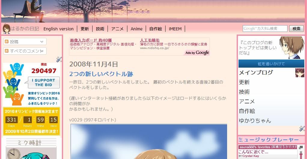
(It doesn't really differ much, doesn't it?)
And here's the one from before I used that layout: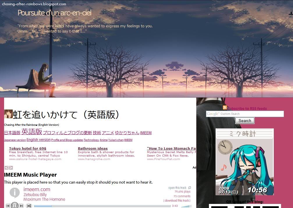
(Looks nice, but the header image is too large. Despite the large screenshot, the first post can't be seen here. That thing between the header and the ad is an early version of the current side navigation menu. Can't believe how large the text was.)
Will I apply the new layout to the English version too? Well, I haven't decided on that yet, but I did apply the same, consistent, layout for the Anime (Japanese & English) and drawings blogs that previously had bizarre layouts and inconsistency that, looking back, is horrible.
Sunday, June 14, 2009
Re-writing code of anime watch list
Although the newer version might appear identical to the previous version, the code used has been changed. The old code contain stuff like "tr" or "wbr" that I don't really understand. Also, the old table code might appear inwards on Gecko-based browsers (eg. Firefox), but appear normal on other browsers. There also was this mysterious gap between two images.
With code learn from the current versions of my story and the navigation menus, I decided to apply it here too. Using the trial-and-error method at the testing blog (to try something new and in the case something goes wrong), I managed to put this up.
Under the hood changes include:
- Changing font colour codes: "white" and "black" became "#fff" and "#000" respectively.
- Using CSS codes instead of HTML to create the border and background colour. (This seems to fix the problem)
- Used stylesheet for the thumbnails as a background instead of as an image source.
- The first column below the header of each set of tables are now merged and the text aligned to the right.
- Table-within-a-table was used to create listing itself.
- Since the image URLs are move to somewhere else, the codes are easier to work on.
Noticeable changes include:
- Removal of "Current (...)" and "Upcomming (...)" and kept the words in prephansis.
- Header text is now aligned to the left.
- "Segoe UI" and "Myriad Pro" fonts are used for the English version, while "Meiryo" (メイリオ) and "VL PGothic" (VL Pゴシック) will be used for the Japanese versions. (Note: Segoe UI and Meiryo is included in Windows Vista or newer and recent versions of Microsoft Office/Live, Myriad Pro is included with Mac OS X and in a hidden folder of Adobe Reader. VL PGothic comes with OpenOffice.org, and is most likely to be included with recent versions of various Linux distributions if Japanese was installed as one of the display languages.)
- Images for Umineko, Yoku, and Kobato are added.
- "Ep" is replaced by "Currently at episode" and "Date" is replaced by "Commencing on"
Wednesday, June 3, 2009
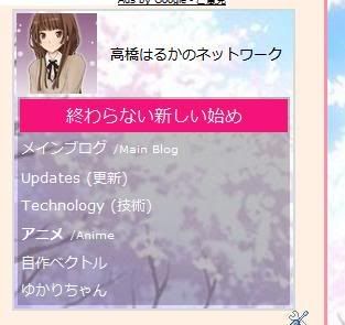
Changes in the navigation menu
Well, my navigation menu you see on the top of the right widget bar is starting to get messier and uglier that I have decided to do a brand new one from scratch. Actually, it got ugly and bulkier from the last update. Not only in appearance, but also the code involved. They are originally supposed to all look the same, with only the title and type of blog changed.
(extracted from an earlier post)
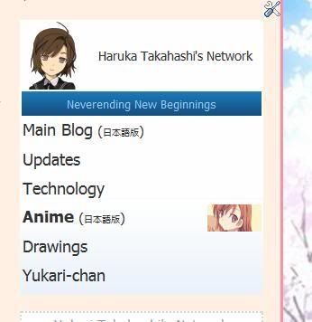
The navigation menu featured here is what it looked like when I first made it. Clean and simple. That empty space there was intentional, but I added random quotes or "Haruka Takahashi's Network". For ones that had the former, it was latter replaced with my latest post from Twitter. Also, hovering over a link there would have a background, but as I found out later on, this also affected other links on the blog. That problem wasn't really fixed until just last month.
(From Updates and Anime blog (English version) blogs.)
Shortly after doing v0030a, I replaced the image and have it aligned to the left. I have also made the links larger and if you hover the row where a particular link is, an image would appear. These are 60*60 images that are (at that time) also used for displaying my drawings on my non-main blogs, which itself, has now changed to 80*80 versions. In the case of the links to the Main and Technology blogs, new ones were used. If the blog does not already have a search box, I would add it as part of the menu.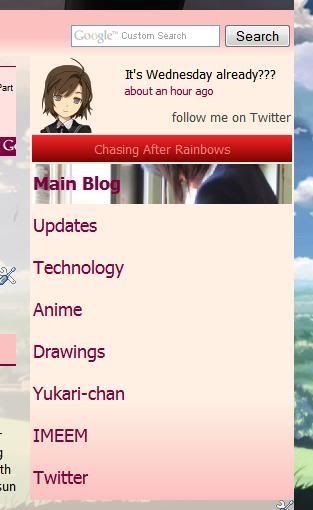
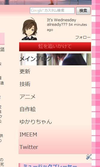
(Japanese & English versions of my main blogs. Search box is not part of the navigation menu.)
The pink/red colours were originally part of an experiment to try different colours of the navigation menu, but didn't really work out well, especially with the strong red for the title. Since both blogs uses mostly pink/red and matches more than the blue version, I have left it untouched.
Also, I found the images to be quite small and decided to have it occupy the entire row. At first, it was to have the image to gradually fade from transparent to opaque from left to right and have it aligned on the far right, but it looked horrible and editing the images to get it was too troublesome. So I gave up and have it to occupy it completely. Since the blog layout that has this menu the widest is the drawings blog (back then) at 280px, I used that as reference for the maximum width.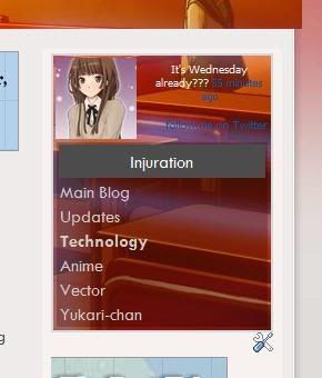
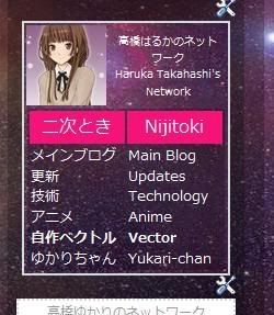
(Technology, Drawings, and Anime (Japanese) blogs)
Not too long ago, Yukari changed her navigation menu and me changing my Twitter page (on the same day as I found images of both the avatar and background). Though simple, it actually looked nice. So in order to improve mine, I have to dump all the image codes except the avatar. The avatar is the exact same image used at Twitter, so the area for my avatar has been reduced from 80*80 to 72*72. Originally, they are supposed to have just a white background, but I use the same background as the blog background or any other image that are already used on the blog. This not only makes it looks nicer, but also save bandwidth from loading the images. Since having an image to appear when hovering over a link is removed, even more bandwidth is saved. That black semi-transparent background is actually recycled from the old drawings blog and helps reading against the textured image easier.
Except for the Anime blog in English, I'm not sure if I want to apply the new version to blogs that are still using the older version for legacy reasons or would actually match the blog layout the most. Currently, the diagonal length of the menu on the Japanese main blog is 5 inches, but the drawings blog is 3 inches. That is quite a lot. I might also replace the avatar of the new navigation menu with an identical-looking v0080 when I'm done with it.
Saturday, May 30, 2009
Twitter page
As an anniversary of reaching 666 posts (not really, but was coincidental), I have changed my Twitter profile page.
Before (via Google cache as at 26 May):
After:
What was not shown is that the avatar was also changed at the same time that looked something like  .
.
Quite a dramatic change, eh?
Thursday, May 28, 2009
Drawings widget removed
Since it's redundant to the drawings blog and takes up too much memory and physical space,I have removed the drawings widget on the Main Blog in English, For now however, similar widgets (though might be of different design) on other blogs are left untouched.
With the empty space left behind, I have moved the box with links to the stories I had written there to that space and made some modifications to have it in the horizontal format instead of the previous vertical positioning format. Notice that the table itself was redesigned recently from a basic plain table. The table may look different due to formatting used for this blog, but codes are not modified from the original.
Vertical format:
|
|
Horizontal:
|
|
Edit: I don't know what caused that large empty space.
Wednesday, May 13, 2009
thinking of a new layout

This is one of the default layouts at Wordpress. I tried to apply my stuff there, but I find the interface confusing over that of blogger. Also, HTML coding I applied there seems to be stripped down to just the text with colours and links.
Friday, May 8, 2009
navigation menu icons changed (again)
On some of my blogs, I have changed the images with this new style. I wanted to do this earlier, but didn't know how. Turns out that I could use an image-editing software that has been installed on the computer, but rarely used, to do this (GIMP). All the time, I was trying to see if the program I had always been using (Inkscape) has this feature. I still need the latter program for sizing and cropping to the exact dimensions though.
For example, if you were to hover over "Anime", the new version should display  as the background. For the older version, it would be
  or, if I didn't modify as a result of the recent resizing of square thumbnails,
  . Notice the gradual transparency. As there are some problems with the colour scheme with these new images, I might need to do some adjusting or even replace with new ones.
 Problem is that, except for ones based on my vectors, finding the original source image again is hard as they are scattered all over. I might also have to remove the borders and that background colour when hovering over text links anywhere on that page.
If you didn't know, that image is from the infamous "WASUREMONO" scene:
Tuesday, May 5, 2009
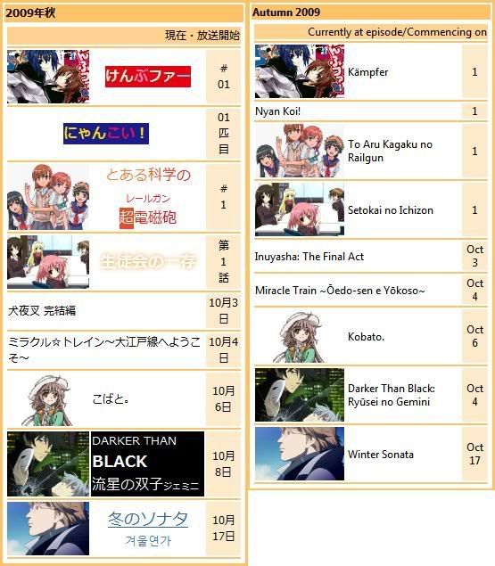
Anime watch list changes (5 May 2009)
Nothing major this time. As I have updated the upcoming anime list, it would be appropriate for me to update the list too. That list contains only the anime I would like to watch, not everything. Except ones that do not have an official website, hovering over the text for a while would have the alternate language name to appear.
Anyways, here are the changes:
- Removed "Saki" entry
- Changed icon image for "Eden of the East"
- Added image for "Winter Sonata"
- Moved "Taishō Yakyū Musume." from "Autumn/Unknown" to "Summer"
- "Yoku Wakaru Gendai Mahō" has been confirmed to first air on 11 July
- Added "Sora no Manimani", "Tokyo Magnitude 8.0", "Umineko no Naku Koro ni", "Zan Sayonara Zetsubō Sensei", "Kobato.", and "To Aru Kagaku no Railgun"
- Except for "Umineko no Naku Koro ni" and "Kobato.", all names mentioned in the previous point has images added.
I'm planning to redesign the way my vectors are displayed for my main blogs (v3). The earlier version (v2) is only suitable to be displayed at the sidebar, which, the main blogs lacks in the horizontal section. Right now, it's using an even earlier version (v1).
Why would I want to change?
- ugly overall layout design
- inconsistency with other non-main blogs (even the drawings blog uses v2)
- fails in space optimization
- inconsistent size of thumbnails, despite all having a common height. V2 has fixed this problem by cropping certain areas with the thumbnail being at common dimensions. Thumbnails used in v3 may be larger than that used in v2.
To make things clear on how much bandwith might be saved between v1 and v2, I have found out that
 uses many times less memory than
  , but since resizing codes were used, the latter thumbnail is actually . Also, I have earlier reduced the maximum of the smallest length from 1800px to 1280px, and now to 1024px. If I didn't change, v0058 would be just above 1MB, the limit for most image hosting sites. For simplicity's sake, I might also reduce the size from 1024px to 1000px in the future. That small difference might reduce bandwidth and memory space too.
Monday, April 20, 2009
counter changed
Less than 24 hours ago, I have decided to changed my counter provider. I'm not saying the reason why I did so other than that the code for the counter could be easily be use by anyone.
The old one had reached 2109 when I decided to completely remove it (I was the 2100th). Except for my main blog in English (which starts at 2100), all counters would restart at 0. I started the previous counter at end-2008, but I started blogging 2 years before that at this very blog I am posting this in. (Back then, it was called "Neverending New Beginnings" and the URL was just the1iam.blogspot.com, but stuff happened until I have 14 blogs on mainstream sites, 10 of which, are active.)
With the new one, I am now able to tell how much people are viewing each of my blogs, what page they were viewing before coming into mine, what country they are from, what browser, resolution, and operating system they were using. Not surprisingly, the large majority of the traffic were to my anime blog in Japanese. Besides Google and Yahoo! Japan (owned by Softbank, not Yahoo! Inc.), search engines to that particular blog also include BIGLOBE and @nifty. Majority of the traffic to there include "とらドラ オープニング 歌詞" (Toradora opening lyrics), "歌詞 まりあ ほりっく" (Maria Holic lyrics). On a slightly related note, my main blog also had "けいおん ED 歌詞" and "Cagayake!Girls", which is a result of me posting a draft post there on Saturday. I would put up a finalised version when it's done. I might replace the video with the widescreen in HD later on and maybe add closed captioning of the lyrics.
I have even found the page where my page were refered from, and it's only today:
(First screenshot was about the lyrics of the first Toradora opening. Second was about the 2009 re-runs of Haruhi.)
Well, it's hard to say if all this stastics are of any use to me, but it certainly a whole lot better than to not knowing if there are even people viewing my posts. Numbers are meaningless if you don't know what they are for.
According to the ads I put up since October 2007 (earlier than the webcounter), there were 58707 page impressions.
Thursday, April 16, 2009
Rejected Version of "Tokihi (Part 10)"
Once again, I have written a lot of stuff down that mid-way through doing it, found it unsuitable. In this case, however, was because of what I had done for part 25 of the 2nd story (link below) and got carried away with it since it's done just right after. I ended up doing it as a special instead. The reason being that the time it's set is in May Y4, but the incident mentioned here happens in December Y6, which is unsuitable due to the rushed nature of the plot and, as you can see, describes how the main character of the 3rd story would die if events in Part 25 onwards of the 2nd story did not happen. The special I just did is based on, is if the prevention leading to the event did not happen from the victim's point of view, which, coincidentally, happens to be a main character of the 3rd story.
I soon reached home. A lot had happened in school earlier, but the major thing that I did was to show a side of me that others have never seen me with before. Unlike all the other guys, Itsuki never did anything to attract my attention. What puzzles myself is that I am attracted to him, as though my instinct tells me to go with him. I don't really know... wait a minute, my chair seems to have been moved and the seat feels warm and is different from my body heat. It seems that a girl a year older than me was here recently... How is that possible? The door and windows are locked with me having the only keys to those and neither were there signs of breaking in. I have hidden a camera in the celing lights, so I can see what's going on.
Watching the footgage, a girl of my cousin's school in her summer uniform appeared out of thin air. Summer uniform? I thought everyone is wearing the winter ones now, and how is her appearing out of thin air possible? Teleport? Time travel? Those seemed far-fetched, but there's no other exeplenation. Her face and behaviour is very much like Itsuki, but there's no one staying at his house besides himself. Her body seem to be very much like that of a real girl, so it's not possible for her to be Itsuki crossdressing (eww...). She then seem to do something to my computer and then disappear into thin air with a white flash shortly before I entered my room. Looking at what she did, it seems that she had only copied files to my desktop and move over to to another. What are these files?
I open the video file. What I found odd is that the date embedded in the video is the Christmas season of two years from now and it seemed to be a recorded security camera footage. I saw myself deep in thought about something where two guys popped out of nowhere, grab a hold of me and poured huge amounts of liquid of some sort at my eyes. For some reason that seemed to cause pain to my eyes, seeing that I am madly trying to rub my tightly shut eyes, as though trying to relief extreme pain there. Those guys then spun me around a lot of times before pushing me onto the tracks. How mean of them!
Later in the video, I noticed that I was trying to force my eyes open, but failed to. At the same time, trying desperately to get out, but doesn't know which direction to go as the me in the video is too dizzy and blind to know. When I noticed the railroad crossing barrier moving down, I started to get even more desperate and running around aimlessly in the hope I get out of there. This seemed to continue on until I was hit by an oncomming train . The rest of the video was the arrival of police to cordoned off the place as a crime scene. They even covered my body, something they would do if that person had died.
What is this video? A video of me being killed just like that in the near future? But it seems too real for it to be an act. The other file contains two news article relating to the event. One is about the incident happening, while the other contains autopsy reports saying that the liquid that was poured onto my eyes have caused me to permanently go blind (really?) and eyewitness reports saying the people who attacked are strongly linked to the organization that has been targeting my company a lot lately. A funeral has (according to the report dated in the future) been set up for me and that my entire school has a moment of silence and comments from my teachers, classmates, would-be juniors about how good I was. They even interview Itsuki and he said how good I was and loved him. Everyone in the city seems to pay their last respects to me.
Well, I would be sad if I found out that someone close to me were to pass on, but of myself? I don't know what to believe. If it's true, I should take preventive measures. I should start with bringing down their organization or avoid that place completely at that time. But what was I deep in thought with that I don't notice them in the first place?
That is as far as I could go. I might use this when the time in the storyline reaches around November or December Y6. Since it's currently at May Y4, it may take a while to reach there, not to mention that it would co-inside with the other stories.
The problem I'm facing is when writing a part that coincide with another, besides evens that did not affect or involve them, I find that things might be written wrongly, partly due to conflict of what has been written in earlier parts and it's hard to locate or correct them. As you can see, each part of my story is quite long even if the images are to be excluded with text being at regular size.
(Note: "Tokihi" was renamed to "Disoriented Feelings" on 16 June 2009.)
Tuesday, April 14, 2009
Frequent layout changes
(She's laughing at me...)
There are 3 reasons why I have been changing layout frequently lately, minor or major.
- Someone copied me
- Someone complained about a layout/element to me
- The previous layout has become boring/outdated.
For point 2, the first thing I would do is to check who it's from. In most cases, the next step would to modify/remove the offending thing or even completely change the layout.
Point 3 could be because the seasons have changed, the old one looking ugly/outdated, or would not support something new. Even if it does, it might not look nice. Also, this could also be because of point 2 where I was in a rush to change.
I think I would let Yukari to change the layouts she has control over for now. I have too much stuff to do now.
Monday, April 13, 2009
stories list menu redesigned
 To make things more organized, I have redone the "Stories I wrote here" section of the main blog.
3 links in a column is the best I could do without it looking horrible on a 1024 x 768 screen. If the width of the sidebar in it were to be wider, I might accordingly add more.
I have also added feeds of people of Tweeter tweets that has "@asuna888" added to their message. If "@asuna888" is not at the beginning of the message, I will not see it as replies, but it will appear in the feeds if it's the 5 most recent that includes it anywhere in the message.
Thursday, April 9, 2009
navigation menu icons changed
 The navigation menu has been changed recently. With the previous 30px*30px being smaller, and with the introduction of the 60px*60px thumbnail images used for the new way to display my drawings and anime watch list, I find that the larger ones are more flexible as I can use a common image. That means that the drawings blog can now use the same font size as all the other blogs. (The current version of the anime watch list looks different from what I mentioned in the link, as I used what was previously links to friend's blogs. Those links have been upgraded to blog lists at the bottom right.)
Since I have already done 78 vectors, including varying versions of it, it should be more than enough to choose from. The images uses the vector closest to what it represents. However, for the technology and main blogs, I have to look around for the images and make a thumbnail of it. It was not easy to search and figure out the area and size of the thumbnail as the images are not square (aspect ratio of 1:1). Because of this change, the cropped background-less version of v0030, that was at the left of the navigation menu below the header image for the main blog, has been replaced with the same respective icon.
Another new feature added to the menu is that if you were to click on the table cell the link is at, it would function the same as the link, although the cursor might not change and you won't know that the area the cursor is hovered over is a link until you click on it. I could change the cursor to the hand, but the code for the menu is already long, and would confuse people who click with the scroll wheel (to open the link in a new tab) and have nothing happening. For blogs that have a different language version, clicking the area outside the link will bring to that page. (Clicking on the link itself might only load the page again.) The drawings blog is a curious example: where would clicking the link bring you to? The version that receives more views. If you're not sure, use the worded links.
Monday, March 30, 2009
Layout of main blog in English changed
This wasn't really planned, but I have changed the blog theme of the main blog in English. The structure of the layout is not changed, but the images and colours are. Font size and typeface might also be changed later.
Before: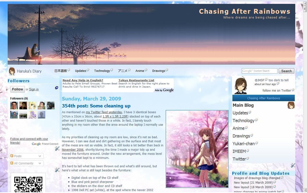
After: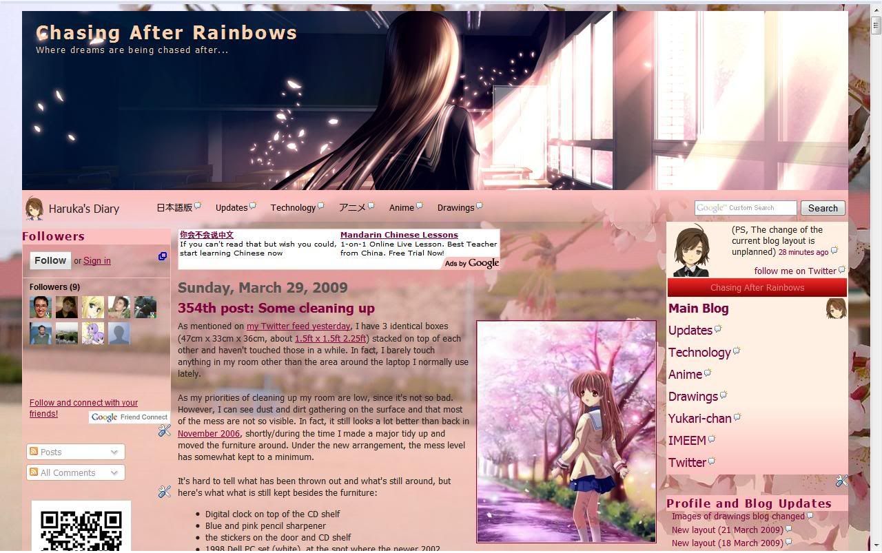
It may not be obvious, but the height of the banner image has changed from 253px to 260px. The current colour scheme of the sidebar is not new as it's already being used on the main blog in Japanese and the drawings blog. You can say that the change is for the spring season, where it represents a new start from the blossoming of the cherry blossom trees. That's why the school year starts in April.
As for what was mentioned in the previous post, I have yet to start resizing, but I did manage to do some progress with v0072. In fact, it's almost complete.
How did I take the screenshot of before & after if it wasn't planned? Well I opened the tab to play music before I started, checked if a background image (now used as the header) would fit and so on. After I was done, I open a new tab after the change, but the version before the change is still open and did not press the refresh button.
5 April edit: It's been brought to my attention that there is a copycat from someone I first saw at friendster 2 years ago. Though not perfect, it's largely resembles my site. Please look at the URL.
Sunday, March 29, 2009
Images of drawings blog changed
Ever since the drawings blog has changed the blog layout to what was previously used on the English Anime blog, I find that since most post were posted via Windows Live Writer, some of the images that is supposed to be transparent or had special effects on it (I don't know why Yukari put them in) had the background of the older layout, on top of the size being too big and overlapping the sidebar.
What I will be planning to do is to reduce all existing regular-sized versions to be reduced from 1280px to 1080px. This is so that images takes lesser time to load and have the size reduced (not thumbnails) looks better. Thumbnails, initial, and other versions of it are unaffected. I might also have the link of the thumbnails at the side there point to the post of it instead of the actual image itself.
(Those other versions, including High-res versions, are in the public folder of the Windows Live Skydrive belonging to someone I know. To get to it, you have to find it via that person's blog and look for the link to it. Hint: That blog is listed under "My Blog List" on my main blog in English. In the pink section of friends' blogs for the Japanese version. Of course, there is a direct link on my Facebook under "Websites" to the profile of it,)
PS. Yukari is rather slow on on putting up my vectors. She's just posted v0068 a while ago, but I had done up to v0071 and about to start working on v0072! What is she doing?
Saturday, March 21, 2009
New layout (21 March 2009)
I know I just made one barely 3 days ago, but I spent most of today creating a new one. I made this by (heavily) modifying the code that was originally meant for my main blog before the current identical-looking version was used. Since I heavily modify it beyond recognition, it would be safe to say that I made it.
So here it is: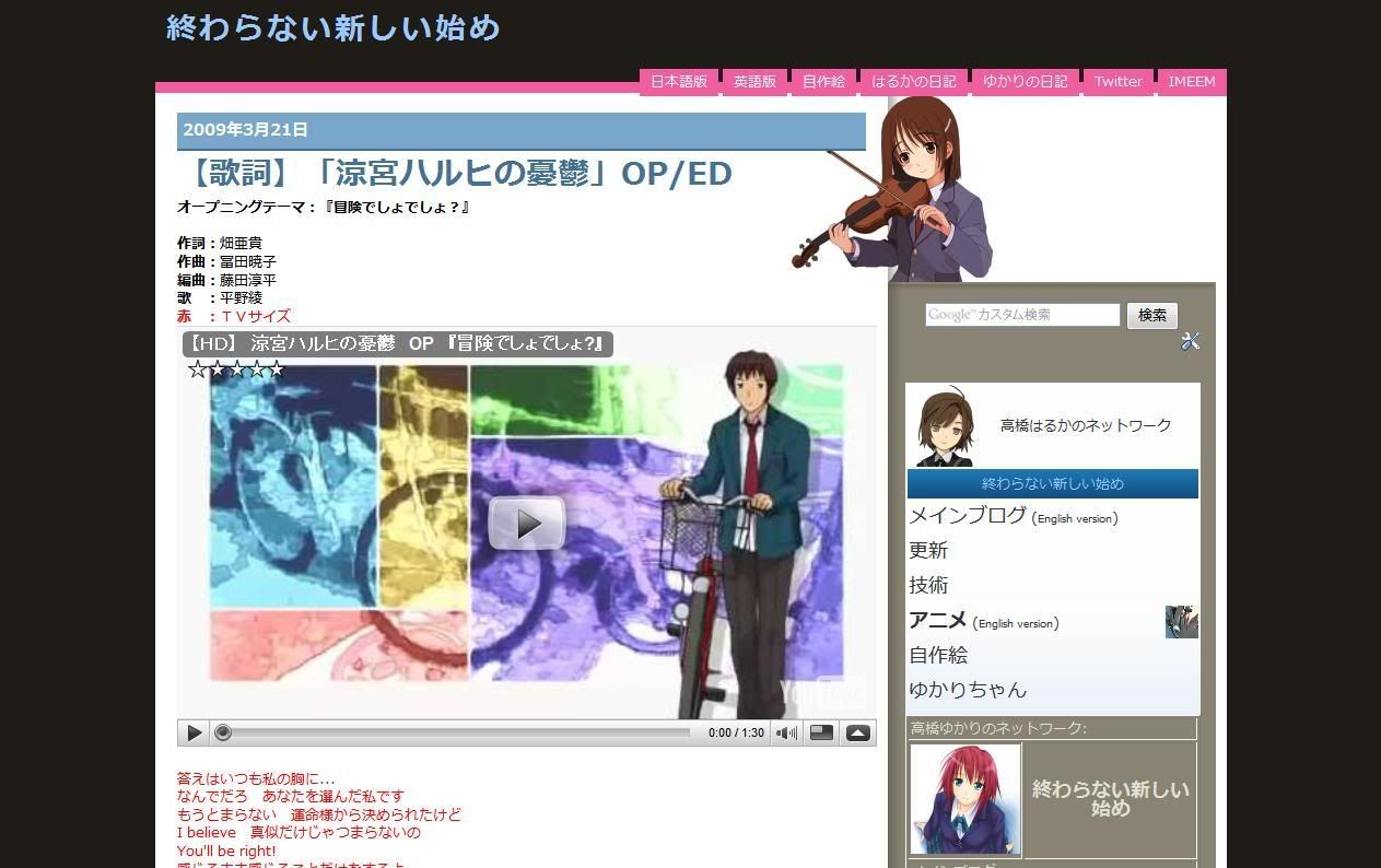
And here's how it looks before that: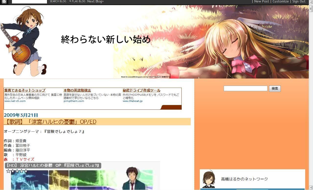
This was taken shortly before the change, so the navigation menu and the search bar has already been separated and the video size reduced. The empty space on the right is the space for an ad, but there's nothing to display there. However, this wasn't what it was supposed to look like and is supported to be identical to the English version, but due to technical difficulties with the blog layout of the latter, only the colours and images were used instead of an entire change.
Here is what it was supposed to look like: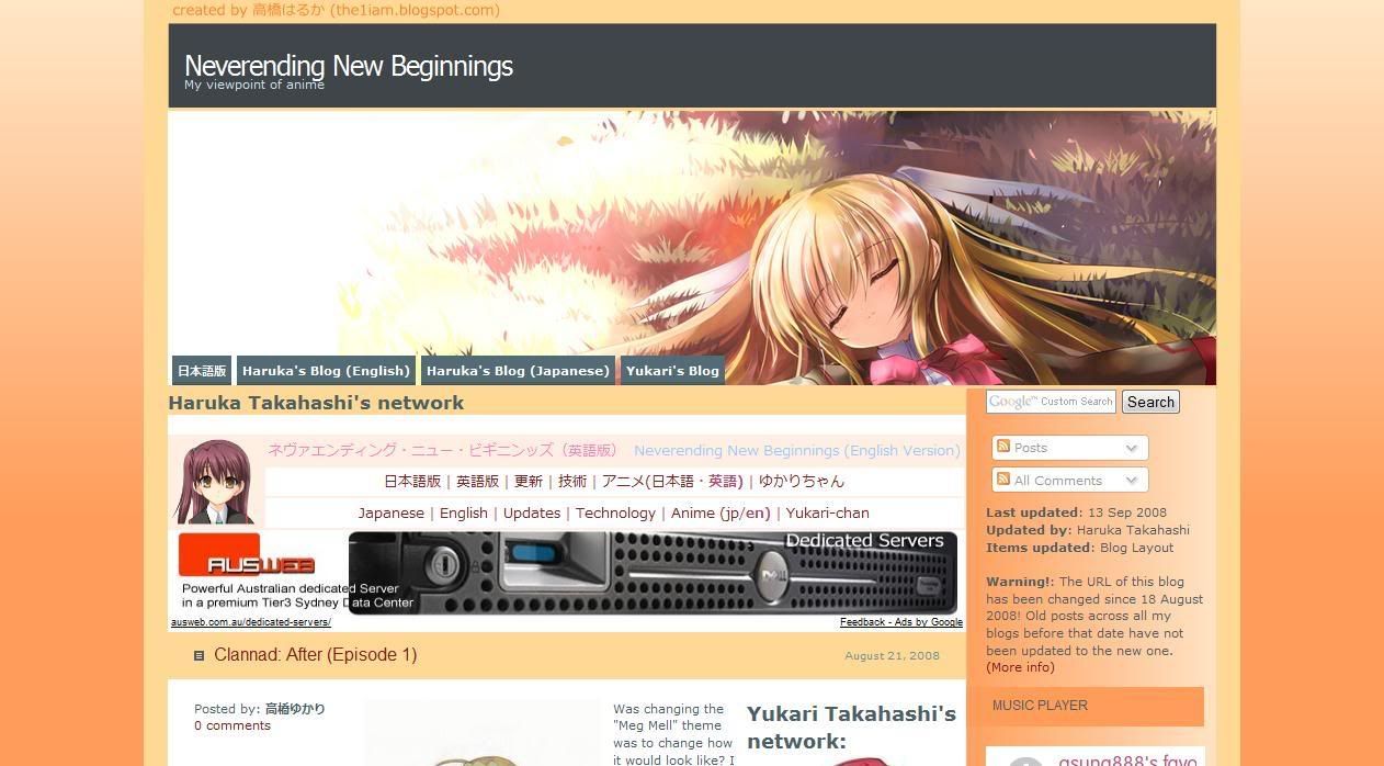
(Notice the navigation menu between the first post and the right sidebar)
Since then, the English version layout was replaced with a layout identical to the layout you see here, the updates blog, and then the layout mentioned in the previous post.
Oh, what was the layout before that? Well, let's say it looks horrible... Huh? You want to see it? Fine, here it is: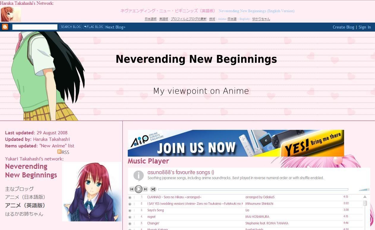
Ah, did you notice? As time passed by, you could see more and more of the first post of the blog. I want to apply this to more blogs, but the layouts there are too nice to replace or would not be suitable. In case you were wondering, this is based on an identical theme that was designed for Wordpress blogs.
Thursday, March 19, 2009
New layout (18 March 2009)
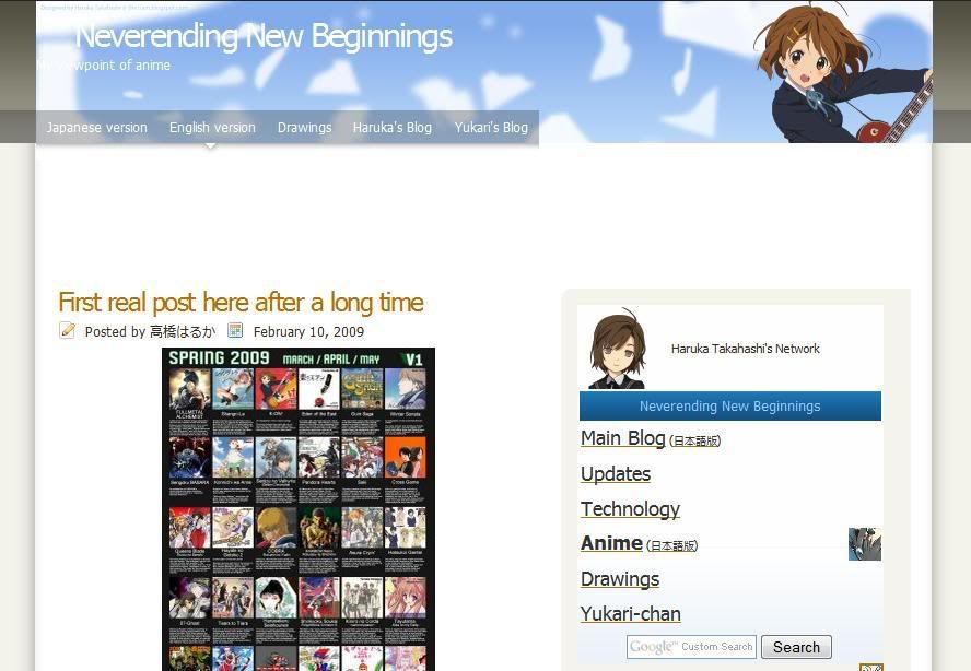
I have applied a new layout to the English edition of the anime blog earlier. This layout is different from what I mentioned earlier, which I ended up applying to one of my hidden blogs, but the drawings does use that theme. Anyways, I changed the themed because it seemed somewhat ugly and outdated because it was made for the autumn theme (which was back in October...) and eyesore to look at now to me.
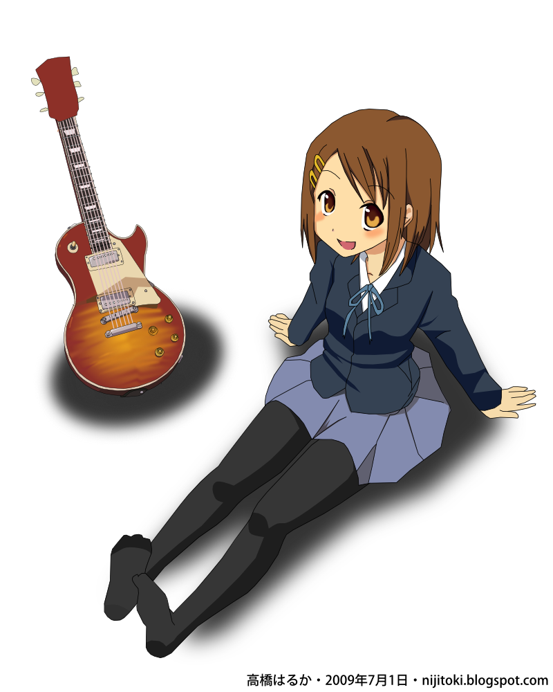
If you find that banner image familiar, that's because the character is from v0051 of my vectors I did back in end-December 2008, which is from "K-on! (けいおん!)" that has an April (Spring) 2009 anime. It's also used as the banner of my IMEEM profile, though the character is larger in terms of DPI. For the background, it's based on the widescreen version of v0003.
(The widescreen version is an easter egg: You have to go to my image server/host or wordpress. The downloadable version of the various versions (including high-res) too.)
I'm not sure if I should call this layout theme as complete. I think I should add Twitter and IMEEM links there seeing that I had those added to my main blog.
I don't know if I should apply to the Japanese version due to sizing issues. As you may know, that blog has received the most number of views. This is partly because it appears as the first link when searching in Google. There is now a sharp contrast of the blog layout designs of the English and Japanese versions. LOL
I might also use this layout on the drawings blog too as that is ugly as hell too. Since most of the post there are uploaded via Windows Live Writer, you might see the background of the old one. As for the reason why only the "Vector (current)" is not clear is because of that program. Besides, I don't want to use up a lot of the limited Blogger/Picasa total image space of 1GB.
Tuesday, March 10, 2009
minor changes to anime watch list
|
| |||||||||||||||||||||||||||||||||


The above are the changes I had made to the existing anime watch list of both the English and Japanese versions of my main blog. The only changes I made was to add images to the left of the title, table borders more visible, and to align the episode numbers at the center. With just these, you can already see the difference as compared to the earlier version that contains only text and links.
The idea came shortly after making thumbnails as a solution to the inconsistent thumbnails for my drawings not too long ago. Except for "To Aru Majutsu no Index", the thumbnails are made from a quick search using Google Images.
"To Aru Majutsu no Index" uses the same image as that for my vector thumbnails. There are vectors done for "Clannad" and "Toradora!" series, but they don't describe the series well and/or don't contain (one of) the main character(s).
If I can come up with an idea on how to make this better and the time to do it, I would, but now is not the time for it. Vector v0068 is about half done and "Alternate Dimension (Part 23)" is almost done. The sidebar navigation menu and drawings widget (both old and new) are both created by me from scratch.
Due to technical reasons, I can't upgrade the anime watch list that appears on the Japanese-language anime blog. Also, I'm aware that, for Internet Explorer users, my drawings may appear larger than your browser window. The cause of this is the percent (%) based instead of pixel (px) based value for the width of the image. With the final version of IE8 releasing quite soon and the fact that other browsers that are more web-standards compliant like Firefox and Safari/Crome renders it correctly, I don't see the point of fixing it, especially IE6, which is considered outdated but ironically still widely used today. Blame this on people not aware/seeing the need to upgrade, preferring XP over Vista on a new PC for "compatibility reasons" or cite problems in Vista they heard that has already been fixed a long time ago.


