I have changed (again) the theme of my main English-language blog from Autumn to Winter. Reason why I'm doing it early is that I would foresee not having the time to do so when the time comes. Right now, I have changed mostly everything except the header image and blog title & description, since I have yet to decide on a suitable image and can't change the colour of the text there until I have chosen the image beneath it.
22:32 edit: I have found the images for the banner. The concept you see now is not new: it was used back in April this year, but now I know how to easily position the images that are not positioned to the left.
Monday, November 10, 2008
English main blog theme changed (Nov 2008)
Tuesday, November 4, 2008
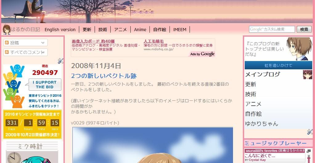
New top navigation menu

I have redone the top navigation bar of the Japanese-language version of my main blog a while ago. Even though it looks complete, I still need to check for alignment problems on Trident and WebKit-based browsers. Speaking of Trident-based browsers, I won't be fixing problems that only appears in IE6 as that is, by today's standards, outdated.
As the links in the new navigation menu are carried over from the earlier version, I need to remove some codes (eg. background image) in order to fit in nicely. Currently, the links are aligned towards the left. I want it to be at the center. The search box has been moved from the other navigation menu and on to the new one.
I'm thinking of applying this to the English-language version too, but seeing that I am going to change the current autumn theme to winter somewhere between the end of this month and the beginning of the next, maybe later.
Sunday, November 2, 2008
progress of vector v0029
 I started doing this on the night of 30 October and normally be able to complete it within 24-48 hours from the starting time.
What is taking it longer than usual is that, apart from distractions not relating to this, is that you may have noticed that the outline closely matches the nearby colour region instead. On my earlier vectors, I would use the default black (#000000) instead for the outline. But that was until I discovered this feature, along with the blurring effect. I should get around to complete this soon. When it's ready, it should appear at the "My Drawings"/"自作絵" sections of my main and anime blogs, along with a post on the drawings blog, with a resolution much larger than what you see here..
Speaking of blurring, you might have noticed that v0022 had been edited closer to the source image with the pink shadow effect. I wanted to do that effect via radical gradient, but it did not turn out well. So I had instead used a 25% transparent pink as the background instead until I fixed it. Another is the shadow part of v0011: It didn't look nice on shapes with angular lines and flat colours overlapping each other. The solution was to blur it.
You might have also notice in both cases that a white non-transparent, background has been used instead of a totally (or semi) transparent one. It's not noticeable if the colour underneath it is white, but when placed against black or orange background, it wouldn't look nice.


