I know I just made one barely 3 days ago, but I spent most of today creating a new one. I made this by (heavily) modifying the code that was originally meant for my main blog before the current identical-looking version was used. Since I heavily modify it beyond recognition, it would be safe to say that I made it.
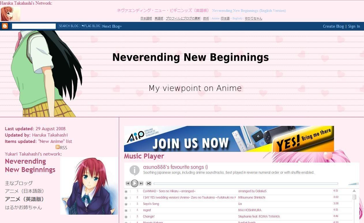
So here it is:
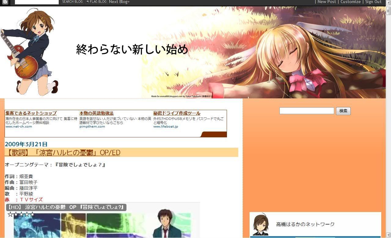
And here's how it looks before that:
This was taken shortly before the change, so the navigation menu and the search bar has already been separated and the video size reduced. The empty space on the right is the space for an ad, but there's nothing to display there. However, this wasn't what it was supposed to look like and is supported to be identical to the English version, but due to technical difficulties with the blog layout of the latter, only the colours and images were used instead of an entire change.
Here is what it was supposed to look like:
(Notice the navigation menu between the first post and the right sidebar)
Since then, the English version layout was replaced with a layout identical to the layout you see here, the updates blog, and then the layout mentioned in the previous post.
Oh, what was the layout before that? Well, let's say it looks horrible... Huh? You want to see it? Fine, here it is:
Ah, did you notice? As time passed by, you could see more and more of the first post of the blog. I want to apply this to more blogs, but the layouts there are too nice to replace or would not be suitable. In case you were wondering, this is based on an identical theme that was designed for Wordpress blogs.
skip to main |
skip to sidebar
List of updates to my profile and blogs.


