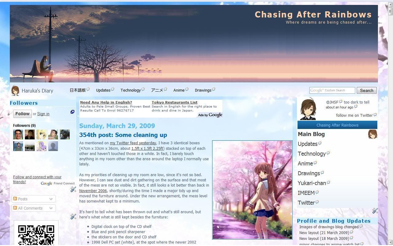
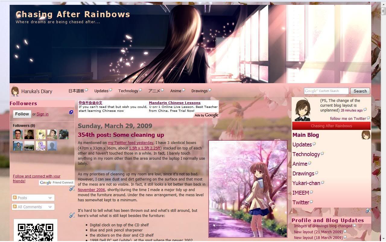
This wasn't really planned, but I have changed the blog theme of the main blog in English. The structure of the layout is not changed, but the images and colours are. Font size and typeface might also be changed later.
Before:
After:
It may not be obvious, but the height of the banner image has changed from 253px to 260px. The current colour scheme of the sidebar is not new as it's already being used on the main blog in Japanese and the drawings blog. You can say that the change is for the spring season, where it represents a new start from the blossoming of the cherry blossom trees. That's why the school year starts in April.
As for what was mentioned in the previous post, I have yet to start resizing, but I did manage to do some progress with v0072. In fact, it's almost complete.
How did I take the screenshot of before & after if it wasn't planned? Well I opened the tab to play music before I started, checked if a background image (now used as the header) would fit and so on. After I was done, I open a new tab after the change, but the version before the change is still open and did not press the refresh button.
5 April edit: It's been brought to my attention that there is a copycat from someone I first saw at friendster 2 years ago. Though not perfect, it's largely resembles my site. Please look at the URL.
skip to main |
skip to sidebar
List of updates to my profile and blogs.


