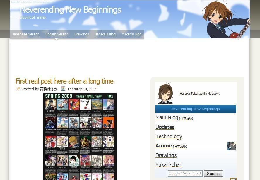
I have applied a new layout to the English edition of the anime blog earlier. This layout is different from what I mentioned earlier, which I ended up applying to one of my hidden blogs, but the drawings does use that theme. Anyways, I changed the themed because it seemed somewhat ugly and outdated because it was made for the autumn theme (which was back in October...) and eyesore to look at now to me.
If you find that banner image familiar, that's because the character is from v0051 of my vectors I did back in end-December 2008, which is from "K-on! (けいおん!)" that has an April (Spring) 2009 anime. It's also used as the banner of my IMEEM profile, though the character is larger in terms of DPI. For the background, it's based on the widescreen version of v0003.
(The widescreen version is an easter egg: You have to go to my image server/host or wordpress. The downloadable version of the various versions (including high-res) too.)
I'm not sure if I should call this layout theme as complete. I think I should add Twitter and IMEEM links there seeing that I had those added to my main blog.
I don't know if I should apply to the Japanese version due to sizing issues. As you may know, that blog has received the most number of views. This is partly because it appears as the first link when searching in Google. There is now a sharp contrast of the blog layout designs of the English and Japanese versions. LOL
I might also use this layout on the drawings blog too as that is ugly as hell too. Since most of the post there are uploaded via Windows Live Writer, you might see the background of the old one. As for the reason why only the "Vector (current)" is not clear is because of that program. Besides, I don't want to use up a lot of the limited Blogger/Picasa total image space of 1GB.


