I have replaced the Japanese version of my main blog with this new layout. Readers who had been to my layout-testing blog recently (before it got marked as a spam blog) or had been to my main blog (in English) around Mid-2008 or earlier with "Hatena :: Diary" at the top left. (Hatena is where the layout came from and had to modify to be usable as Blogger Classic code.) This was because the old one started to looked awful and it's kind of ironic that both the English and Japanese started off with the same layout theme at the time I first implemented it (forgot when that was though) and that the former blog started to drift apart. The same layout code was also gradually applied to all my other blogs, but with modifications to make them look different.
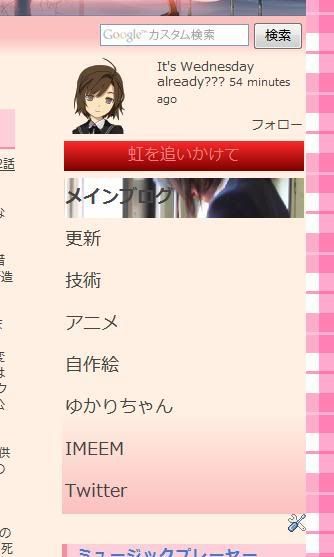
With this change, I have also changed the side navigation menu to the new style since the old one didn't really match well and can't even see the first post without scrolling down a bit. It's been cleaned up with fewer images and having one of the sidebars removed. The space freed up really helped me a lot on making the blog look better.
I looked back at it earlier this week and decide to use it, but I want it to work with Blogger XML instead of the Classic one to modify it easily. I don't need to get a whole new code: I just need to modify the existing one. If you ask me to do the same thing just a year ago, I probably would not know how to do it. Editing the size and additional words to the date involves further digging into the code accessible with the "Expand Widgets Templates" option checked. What annoyed me is that using Blogger's "Font and Color" settings seemed to only work for the colours and not the typeface of the text despite the code being there and had to modify the code manually.
Speaking of codes, I obtained the colour codes via Inkscape (the program I used to do my vectors) by pressing the button to take a screenshot (in Linux, a prompt soon follows asking where to save the screenshot you just did) and pasting it into the the program. This can get tricky: the bottom part (percentage varies) may become corrupted and appears to be random. Do note that the screenshot might be saved as "pastedpic_***.png" at the folder of where you last saved a file with this program (If unsure, check the properties.). To overcome this, paste the image in Paint first and save it as a PNG (or BMP) file and import it. Since the area of the colour you want to choose, especially text, you might want to use the browser's zoom feature to the area in question before taking the screenshot.
The search box at the bottom right is rather unique too. Since it was copied over from the old code, which itself was from Hatena, I don't really know how it appears to be transparent, is fixed on top, and does not move while scrolling the page. I only know how to change the content or position it.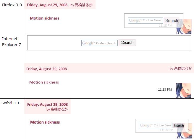
This comparison image was from last year, describing how different the layout of my latest post (back then) was rendered in various browsers with visible differences. Safari is the one that follows the web standards the most, and Internet Explorer (version 6 and earlier especially) the least.
I didn't make a screenshot before to the current layout, but I did manage to find one of the same layout from quite some time ago: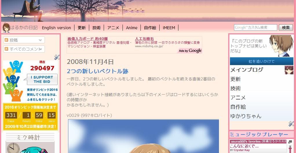
(It doesn't really differ much, doesn't it?)
And here's the one from before I used that layout:
(Looks nice, but the header image is too large. Despite the large screenshot, the first post can't be seen here. That thing between the header and the ad is an early version of the current side navigation menu. Can't believe how large the text was.)
Will I apply the new layout to the English version too? Well, I haven't decided on that yet, but I did apply the same, consistent, layout for the Anime (Japanese & English) and drawings blogs that previously had bizarre layouts and inconsistency that, looking back, is horrible.
Thursday, June 18, 2009
New layout (18 June 2009)
Sunday, June 14, 2009
Re-writing code of anime watch list
Although the newer version might appear identical to the previous version, the code used has been changed. The old code contain stuff like "tr" or "wbr" that I don't really understand. Also, the old table code might appear inwards on Gecko-based browsers (eg. Firefox), but appear normal on other browsers. There also was this mysterious gap between two images.
With code learn from the current versions of my story and the navigation menus, I decided to apply it here too. Using the trial-and-error method at the testing blog (to try something new and in the case something goes wrong), I managed to put this up.
Under the hood changes include:
- Changing font colour codes: "white" and "black" became "#fff" and "#000" respectively.
- Using CSS codes instead of HTML to create the border and background colour. (This seems to fix the problem)
- Used stylesheet for the thumbnails as a background instead of as an image source.
- The first column below the header of each set of tables are now merged and the text aligned to the right.
- Table-within-a-table was used to create listing itself.
- Since the image URLs are move to somewhere else, the codes are easier to work on.
Noticeable changes include:
- Removal of "Current (...)" and "Upcomming (...)" and kept the words in prephansis.
- Header text is now aligned to the left.
- "Segoe UI" and "Myriad Pro" fonts are used for the English version, while "Meiryo" (メイリオ) and "VL PGothic" (VL Pゴシック) will be used for the Japanese versions. (Note: Segoe UI and Meiryo is included in Windows Vista or newer and recent versions of Microsoft Office/Live, Myriad Pro is included with Mac OS X and in a hidden folder of Adobe Reader. VL PGothic comes with OpenOffice.org, and is most likely to be included with recent versions of various Linux distributions if Japanese was installed as one of the display languages.)
- Images for Umineko, Yoku, and Kobato are added.
- "Ep" is replaced by "Currently at episode" and "Date" is replaced by "Commencing on"
Wednesday, June 3, 2009
Changes in the navigation menu
Well, my navigation menu you see on the top of the right widget bar is starting to get messier and uglier that I have decided to do a brand new one from scratch. Actually, it got ugly and bulkier from the last update. Not only in appearance, but also the code involved. They are originally supposed to all look the same, with only the title and type of blog changed.
(extracted from an earlier post)
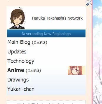
The navigation menu featured here is what it looked like when I first made it. Clean and simple. That empty space there was intentional, but I added random quotes or "Haruka Takahashi's Network". For ones that had the former, it was latter replaced with my latest post from Twitter. Also, hovering over a link there would have a background, but as I found out later on, this also affected other links on the blog. That problem wasn't really fixed until just last month.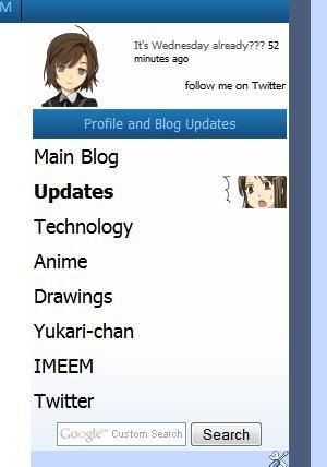
(From Updates and Anime blog (English version) blogs.)
Shortly after doing v0030a, I replaced the image and have it aligned to the left. I have also made the links larger and if you hover the row where a particular link is, an image would appear. These are 60*60 images that are (at that time) also used for displaying my drawings on my non-main blogs, which itself, has now changed to 80*80 versions. In the case of the links to the Main and Technology blogs, new ones were used. If the blog does not already have a search box, I would add it as part of the menu.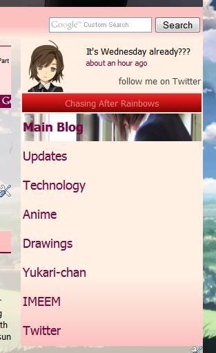
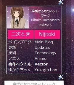
(Japanese & English versions of my main blogs. Search box is not part of the navigation menu.)
The pink/red colours were originally part of an experiment to try different colours of the navigation menu, but didn't really work out well, especially with the strong red for the title. Since both blogs uses mostly pink/red and matches more than the blue version, I have left it untouched.
Also, I found the images to be quite small and decided to have it occupy the entire row. At first, it was to have the image to gradually fade from transparent to opaque from left to right and have it aligned on the far right, but it looked horrible and editing the images to get it was too troublesome. So I gave up and have it to occupy it completely. Since the blog layout that has this menu the widest is the drawings blog (back then) at 280px, I used that as reference for the maximum width.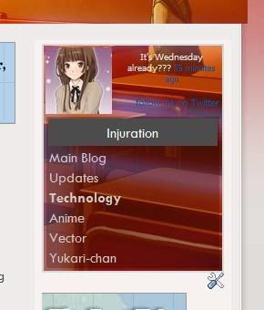
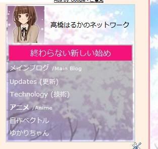
(Technology, Drawings, and Anime (Japanese) blogs)
Not too long ago, Yukari changed her navigation menu and me changing my Twitter page (on the same day as I found images of both the avatar and background). Though simple, it actually looked nice. So in order to improve mine, I have to dump all the image codes except the avatar. The avatar is the exact same image used at Twitter, so the area for my avatar has been reduced from 80*80 to 72*72. Originally, they are supposed to have just a white background, but I use the same background as the blog background or any other image that are already used on the blog. This not only makes it looks nicer, but also save bandwidth from loading the images. Since having an image to appear when hovering over a link is removed, even more bandwidth is saved. That black semi-transparent background is actually recycled from the old drawings blog and helps reading against the textured image easier.
Except for the Anime blog in English, I'm not sure if I want to apply the new version to blogs that are still using the older version for legacy reasons or would actually match the blog layout the most. Currently, the diagonal length of the menu on the Japanese main blog is 5 inches, but the drawings blog is 3 inches. That is quite a lot. I might also replace the avatar of the new navigation menu with an identical-looking v0080 when I'm done with it.


