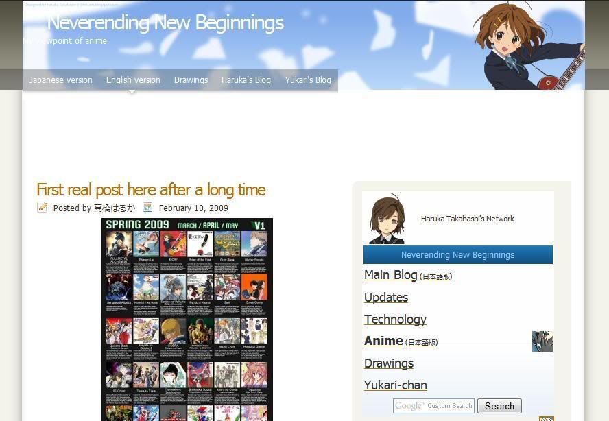
This wasn't really planned, but I have changed the blog theme of the main blog in English. The structure of the layout is not changed, but the images and colours are. Font size and typeface might also be changed later.
Before: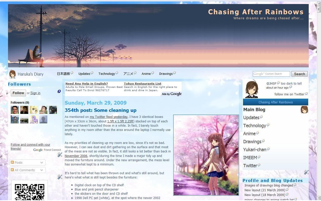
After: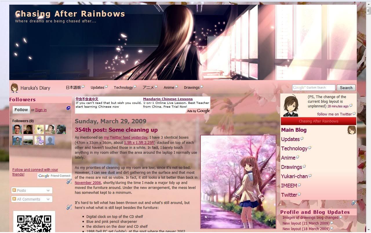
It may not be obvious, but the height of the banner image has changed from 253px to 260px. The current colour scheme of the sidebar is not new as it's already being used on the main blog in Japanese and the drawings blog. You can say that the change is for the spring season, where it represents a new start from the blossoming of the cherry blossom trees. That's why the school year starts in April.
As for what was mentioned in the previous post, I have yet to start resizing, but I did manage to do some progress with v0072. In fact, it's almost complete.
How did I take the screenshot of before & after if it wasn't planned? Well I opened the tab to play music before I started, checked if a background image (now used as the header) would fit and so on. After I was done, I open a new tab after the change, but the version before the change is still open and did not press the refresh button.
5 April edit: It's been brought to my attention that there is a copycat from someone I first saw at friendster 2 years ago. Though not perfect, it's largely resembles my site. Please look at the URL.
Monday, March 30, 2009
Layout of main blog in English changed
Sunday, March 29, 2009
Images of drawings blog changed
Ever since the drawings blog has changed the blog layout to what was previously used on the English Anime blog, I find that since most post were posted via Windows Live Writer, some of the images that is supposed to be transparent or had special effects on it (I don't know why Yukari put them in) had the background of the older layout, on top of the size being too big and overlapping the sidebar.
What I will be planning to do is to reduce all existing regular-sized versions to be reduced from 1280px to 1080px. This is so that images takes lesser time to load and have the size reduced (not thumbnails) looks better. Thumbnails, initial, and other versions of it are unaffected. I might also have the link of the thumbnails at the side there point to the post of it instead of the actual image itself.
(Those other versions, including High-res versions, are in the public folder of the Windows Live Skydrive belonging to someone I know. To get to it, you have to find it via that person's blog and look for the link to it. Hint: That blog is listed under "My Blog List" on my main blog in English. In the pink section of friends' blogs for the Japanese version. Of course, there is a direct link on my Facebook under "Websites" to the profile of it,)
PS. Yukari is rather slow on on putting up my vectors. She's just posted v0068 a while ago, but I had done up to v0071 and about to start working on v0072! What is she doing?
Saturday, March 21, 2009
New layout (21 March 2009)
I know I just made one barely 3 days ago, but I spent most of today creating a new one. I made this by (heavily) modifying the code that was originally meant for my main blog before the current identical-looking version was used. Since I heavily modify it beyond recognition, it would be safe to say that I made it.
So here it is: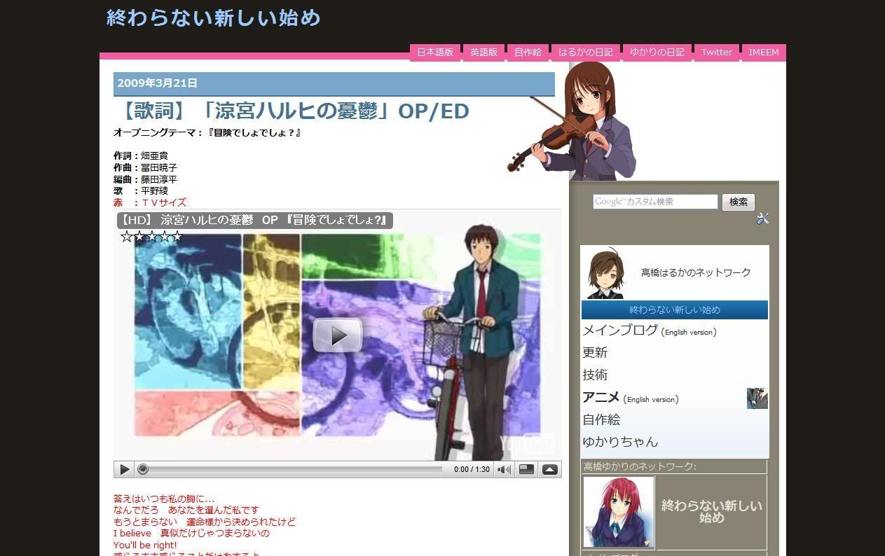
And here's how it looks before that: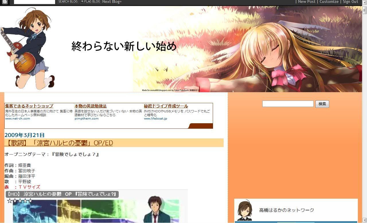
This was taken shortly before the change, so the navigation menu and the search bar has already been separated and the video size reduced. The empty space on the right is the space for an ad, but there's nothing to display there. However, this wasn't what it was supposed to look like and is supported to be identical to the English version, but due to technical difficulties with the blog layout of the latter, only the colours and images were used instead of an entire change.
Here is what it was supposed to look like:
(Notice the navigation menu between the first post and the right sidebar)
Since then, the English version layout was replaced with a layout identical to the layout you see here, the updates blog, and then the layout mentioned in the previous post.
Oh, what was the layout before that? Well, let's say it looks horrible... Huh? You want to see it? Fine, here it is:
Ah, did you notice? As time passed by, you could see more and more of the first post of the blog. I want to apply this to more blogs, but the layouts there are too nice to replace or would not be suitable. In case you were wondering, this is based on an identical theme that was designed for Wordpress blogs.
Thursday, March 19, 2009
New layout (18 March 2009)
I have applied a new layout to the English edition of the anime blog earlier. This layout is different from what I mentioned earlier, which I ended up applying to one of my hidden blogs, but the drawings does use that theme. Anyways, I changed the themed because it seemed somewhat ugly and outdated because it was made for the autumn theme (which was back in October...) and eyesore to look at now to me.
If you find that banner image familiar, that's because the character is from v0051 of my vectors I did back in end-December 2008, which is from "K-on! (けいおん!)" that has an April (Spring) 2009 anime. It's also used as the banner of my IMEEM profile, though the character is larger in terms of DPI. For the background, it's based on the widescreen version of v0003.
(The widescreen version is an easter egg: You have to go to my image server/host or wordpress. The downloadable version of the various versions (including high-res) too.)
I'm not sure if I should call this layout theme as complete. I think I should add Twitter and IMEEM links there seeing that I had those added to my main blog.
I don't know if I should apply to the Japanese version due to sizing issues. As you may know, that blog has received the most number of views. This is partly because it appears as the first link when searching in Google. There is now a sharp contrast of the blog layout designs of the English and Japanese versions. LOL
I might also use this layout on the drawings blog too as that is ugly as hell too. Since most of the post there are uploaded via Windows Live Writer, you might see the background of the old one. As for the reason why only the "Vector (current)" is not clear is because of that program. Besides, I don't want to use up a lot of the limited Blogger/Picasa total image space of 1GB.
Tuesday, March 10, 2009
minor changes to anime watch list
|
| |||||||||||||||||||||||||||||||||


The above are the changes I had made to the existing anime watch list of both the English and Japanese versions of my main blog. The only changes I made was to add images to the left of the title, table borders more visible, and to align the episode numbers at the center. With just these, you can already see the difference as compared to the earlier version that contains only text and links.
The idea came shortly after making thumbnails as a solution to the inconsistent thumbnails for my drawings not too long ago. Except for "To Aru Majutsu no Index", the thumbnails are made from a quick search using Google Images.
"To Aru Majutsu no Index" uses the same image as that for my vector thumbnails. There are vectors done for "Clannad" and "Toradora!" series, but they don't describe the series well and/or don't contain (one of) the main character(s).
If I can come up with an idea on how to make this better and the time to do it, I would, but now is not the time for it. Vector v0068 is about half done and "Alternate Dimension (Part 23)" is almost done. The sidebar navigation menu and drawings widget (both old and new) are both created by me from scratch.
Due to technical reasons, I can't upgrade the anime watch list that appears on the Japanese-language anime blog. Also, I'm aware that, for Internet Explorer users, my drawings may appear larger than your browser window. The cause of this is the percent (%) based instead of pixel (px) based value for the width of the image. With the final version of IE8 releasing quite soon and the fact that other browsers that are more web-standards compliant like Firefox and Safari/Crome renders it correctly, I don't see the point of fixing it, especially IE6, which is considered outdated but ironically still widely used today. Blame this on people not aware/seeing the need to upgrade, preferring XP over Vista on a new PC for "compatibility reasons" or cite problems in Vista they heard that has already been fixed a long time ago.
Saturday, March 7, 2009
New way to display drawings
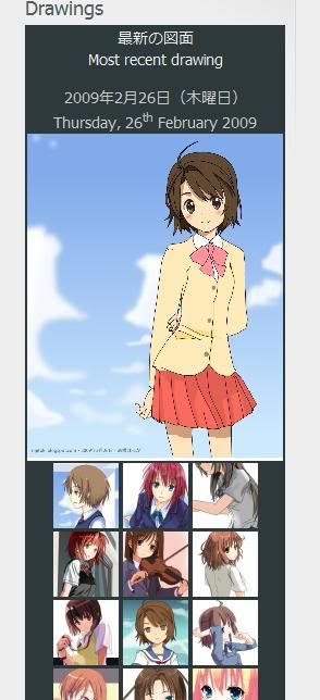
Although unintentional, when you hover over the thumbnails, there would be a nice highlight on the empty space below the image when you hover over it. This was a spillover that was applied to the whole blog from the codes of my navigation menu normally placed at the very top of the sidebar.
As of typing this, I am in the middle of editing for the drawings blog. The widget of that blog contains all of my drawings instead of featured ones, the thumbnails (yes, I make those manually) may take a while to do so. Until I'm done with it, the older version would still be there, below it.
The Japanese version of the anime blog will only have it replaced at the same time as the blog layout, but there are no plans to change the ones on my main blog as of this time due to space constrains.
As for the colours used, I haven't really decided other than to follow the theme. It looks nice on a blog with a nice use of colours, but horrible on one that isn't. It is possible for me to use the one you see in the image.
Thursday, March 5, 2009
what I'm up to now
 Seeing that I am busy until mid-March, most of my stuff will not be updated for quite a while. I'm aware that the post on most of my blogs (except the main English) doesn't have any new posts for quite a while.
What I had done recently is updating of a forum, my YouTube Channel, IMEEM profile, and dannychoo.com profile.
As long time readers might know, the English anime blog was originally my main blog, which itself succeeded this updates blog. Anyways, that layout you see currently was actually replaced with an another identical layout, but was buggy. That's why you didn't see me changing the Japanese version other than the colours and images. The layout I replaced with was actually base on my current main blog theme that was used for Autumn and modify the codes to remove the left sidebar and making it look similar to the earlier. If you were to click the link at the bottom of my blogs that is based on this layout (basically all except the ones with Yukari as the co-author), you would notice it bares very little resemblance to the original as I had heavily modify it.
The drawings and anime blogs (both english and japanese) need to be revamped as the current layout looks horrible compared to my main english and technology blogs. Unfortunately, I won't be able to change it for quite a while and may not even bother changing. On the english anime blog, you might notice me putting up this post. The truth behind this post is that I want to put up reviews of recent anime episodes. But I lack the time to post such things and the time it takes for me to vector or write a story eats up a lot of hours.
To my friends: Forgive me if I'm ignoring your calls or can't hear me talking. I'm not good at communicating vocally to the point that my spoken and written vocabulary are completely different. I would rather you message me than to calling. (Messaging me to call you is still considered calling.)


