Although unintentional, when you hover over the thumbnails, there would be a nice highlight on the empty space below the image when you hover over it. This was a spillover that was applied to the whole blog from the codes of my navigation menu normally placed at the very top of the sidebar.
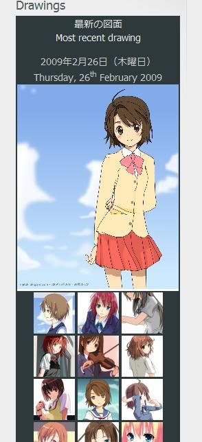
As of typing this, I am in the middle of editing for the drawings blog. The widget of that blog contains all of my drawings instead of featured ones, the thumbnails (yes, I make those manually) may take a while to do so. Until I'm done with it, the older version would still be there, below it.
The Japanese version of the anime blog will only have it replaced at the same time as the blog layout, but there are no plans to change the ones on my main blog as of this time due to space constrains.
As for the colours used, I haven't really decided other than to follow the theme. It looks nice on a blog with a nice use of colours, but horrible on one that isn't. It is possible for me to use the one you see in the image.