Saturday, October 31, 2009

Meanings behind my Twitter lists

At my Twitter page, you would notice that I have created lists of grouping people. If you look at it, you might not understand what they mean. Here are the lists:

  • kagakugijutsu (科学技術): Science and Technology
  • t1-: People from the United States of America and Canada.
  • t4-: People from Europe, including the United Kingdom
  • t5-: People from Latin America, including Mexico
  • t6-: People from Southeast Asia, Australia, and New Zealand
  • t27: People from South Africa
  • t81: People from Japan
  • em2a: People who talk about Anime. The name is spelt backwards, with the "ni" (に) changed to "2"
  • podcast: Owns podcasts that I follow.
  • crs-gmi: Backward spelling of "img src" (image source). Owns sites with interesting info that I regularly visit, not necessarily images.
Do note that I have listed some of the people in more than one lists, or have yet to list, with the latter being overlooked or having a hard time deciding where to put them in.

PS. The layouts of the anime blogs has changed again, but with both English and Japanese version having completely different themes. The former is based on the technology blog, but using the background and colour scheme of the previous, while the latter was unchanged, but changed the background, font and with minor changes to the colour scheme.

Saturday, October 24, 2009

Navigation of Stories Changed


Snippets like this on the right image shows a sample of the first few words of my latest post via RSS. However, when it comes to my stories, especially on search engines, fewer parts of the actual story are visible as they look at the first few words like:


Story 2 Part 19 (middle link) is the worse as it's filled with navigation and notes and none of the actual story actually appearing there, though ironically, it has been fixed several days before Google's cache of that link.

The old navigation links looked something line:
[revised on 25 November 2008]
(continued from part 18)
(related: "Tokihi (Part 8)")
[Author's note: ...]

insert story text here

(to be continued in part 20)

That's why it appears in the snippets and search engine's summary as the notes occupy the top. Here's the newer format of the above:

insert story text here

Part 18
Related: "Disoriented Feelings (Part 8)"
Part 20

[Author's note: ....]

[Revised: 16 February 2009]
This newer format cleans up the mess at the top. Links at the middle would lead to related parts, what chapter this is part of at my Wordpress blog, and so on. More importantly, the actual content of the post is visible in snippets and search results.

Due to an unexpected large amounts of parts I have done, changes will only be done when I decided to make changes to the post itself which is quite random or of my favorites, so you might see a mix of the old and new ones.

Of course, I don't change them blindly: I fixed broken/wrong links along the way. I was aware that in Story 4 Part 2, the link pointing to the continuing part actually points to the previous part. Also, Story 3 has already been renamed from "Tokihi" to "Disoriented Feelings" somewhere in June/July this year.

Ps. My anime blog layout theme looks awful when compared to the technology blog. It's ironic that I designed both of them.

Tuesday, October 13, 2009

Avatar changed

Image at the top right of the navigation menu has been changed from to . In addition, the dimensions of viewable area has been changed from 65px*73px to 55px*55px so that it doesn't take up too much space, but will be vertically expanded automatically if the area left of it contain my feeds from Twitter. These images are based on my vectors numbered v0080 and v0088 respectively.
I have also changed the avatar image at twitter. Between the previous (Senjouhara Hitagi; from Bakemonogatari) and the current one (crop of v0088), I had been using the source image of it shortly before I decided to make a vector of it. However, when uploading the finished vector, I noticed that there is no image appearing in all the browsers, including those that has not been used for weeks. In its place was a broken image icon (blank or hover-over text as normal text in the case of Firefox) where the image supposed to be. I thought it's just me until someone pointed out (from the other side of the globe) that they are seeing the same problem.

The problem has now been fixed. Do note that the background is transparent.

Saturday, October 3, 2009

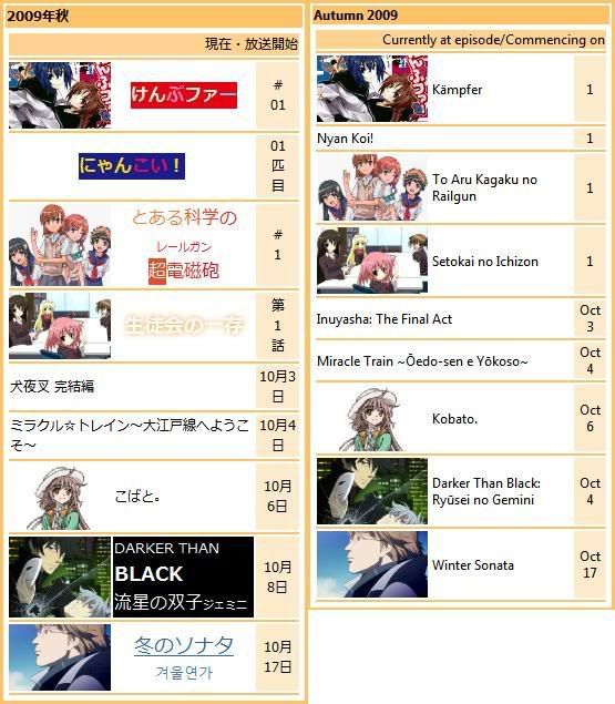
Slight changes to Anime Watch List


Left: Japanese version
Right: English version


Thumbnails has been changed from 60px*60px to 100px*75px. As a result, you can see more details. You might see it cropped in the table (eg. 90px*60px), but the same source image is used.

For the Japanese version, additional coding has been added to make it resemble the logo. Example: "生徒会の一存" has been changed to "生徒会の一存", but due to language reasons, I can't do the same for non-Japanese versions like how do I do "電磁" (Chou Denjin Hou; note the first character) if it's supposed to be pronounced as "Railgun"? Unless there's an official logo in, say, English (which is not likely to appear until after the Japanese broadcast has ended),it's going to look strange.

For technical reasons, I also can't do outline around the text. The closest thing I could do is to have a background or a drop-down effect.

Oh, another oddness you might have noticed in the Japanese version for episode numberings instead of the usual "第2話": Umineko 12 is numbered as "III-I", K-On! 12 (2nd last ep) as "最終回", "第拾壹話" for Bakemonogatari 11, or "#08" and so on. It's based on the numbering shown in the episode itself at the same time as the episode title. On the English version, or if those numberings are not given and is not a special episode, I would follow the numbers that places like wikipeia are using. Anime like "Fullmetal Alchemist" do give the actual numberings along with the title like "第16話「戦友の足跡」"

For reasons not mentioned, Bakemonogatari seems to be using a lot of the old characters (旧字体/舊字體) and fraud-proof (eg. legal documents, cheques) versions for numbers. Also, text that should have been in hiragana are written in their katakana or (obsolete/rarely used) kanji forms. Like "有難ウ御座イマス" instead of "ありがとうございます".