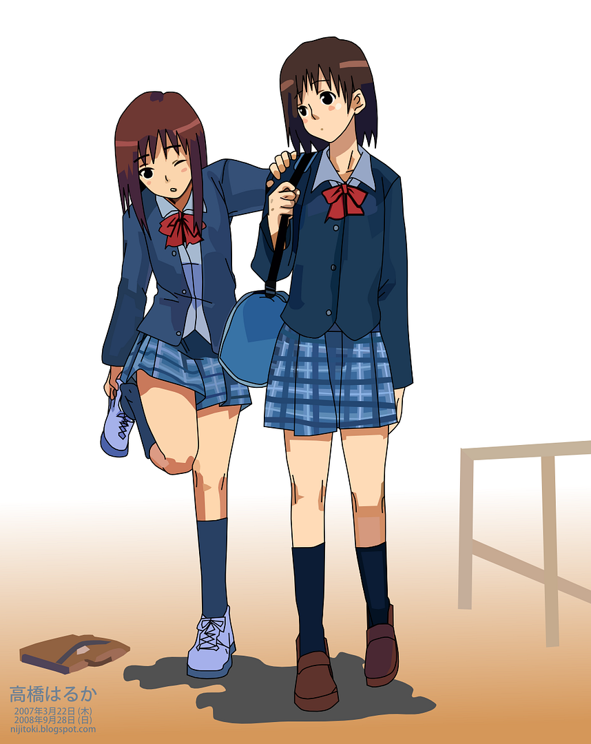
I have change the layout of the drawings blog to a version that I had used back in August or earlier (based on the fact that my latest drawing when I retrieved it was at v0013) on my main blog. Previous layout for the drawings blog was "Minimalism", one of the default Blogger XML layouts. Do note, however, that the current one uses the older classic template.
With winter coming around the corner, about a month away (December), I have yet to decide to use a new layout or just modify the existing one. The latter looks messy at the current state, but the former is difficult to edit from the "Fonts & Colors" layout settings, though that was what the latter was at the beginning.
I have also edited the Japanese-language version of my main blog. I have reduced the sidebar header font size, eliminated the weird empty spacing surrounding that and the sidebar contents. Overall width of post has been reduced from 100% to 96% (at about the same time I did the layout fix) and now 80%. This is so that more of the background can be seen.
Tuesday, October 28, 2008
some minor changes
Tuesday, October 21, 2008
anime blog layout replaced
As mentioned yesterday, I had problems with the blog layout with the English Anime blog layout. It's based on the layout on my main blog, but has been modified to look like the layout that was replaced.
As a result, the weird empty spaced is removed, the text now flows more nicely. Stuff that didn't get carried over from the old one includes:
- background for blog title
- imaged-based borders (replaced by CSS of the same colour)
- background for blog title and description (as above)
- tab-like navigation links
- background of the sidebar
- sidebar header font, colour, size
Thursday, October 16, 2008
navigation menu updated
 | ||
New:
| Profile and Blog Updates | |
| 日本語版 英語版 更新 技術 アニメ(日本語) アニメ(英語) 自作絵 ゆかりちゃん | Japanese ver English ver Updates Technology Anime (jpn) Anime (eng) Drawings Yukari-chan |
(may look different due to the blog template and CSS codes that may overide the ones used here)
I have updated the navigation menu to what you see above. The older version by itself is based on an even earlier version which, if the width is insufficient, would go onto the next line, whereby distorting the alignment of the menu. Before planning to do the new one, I tried to make the text scroll and make it stop if hovered over on my main blog, but it doesn't look right. Sure it prevents from text from going to the next line unless the break rule (br) tag is used, but it just doesn't look right and in fact, even worse.
On top of that the older one, apart from what was mentioned earlier, faces compatibility issues. For example, a strange empty space appears in IE6 and IE7. For the former, the transparent areas of PNG images becomes white-ish blue instead. This problem does not appear in other browsers.
I tried various background images for the new one at first, but it appeared difficult to read. Then I remembered the style I had used on my anime blog recently and applied that to it (along with references to other sites) to become what you see now.
Thursday, October 9, 2008
Minor changes to display of drawings
To deal with this increase, I have already created a new blog that displays vectored that I had done so far, including the versions when I made it in their original resolutions and what are the images used to make it, including ones that I had rejected. However, unless a vector version is done, pencil drawings will not appear here. Except for v0005, all vectors are in numeral order.
Do note that I may put up a vector suddenly without mentioning about it, though there are some exceptions, but only if I had difficulty doing it or made noticable changes.
Saturday, October 4, 2008
IMEEM & Blogger profile theme changed
The profile at IMEEM has been changed. The previous theme looked plain and had not been changed in a long time.
If you had been there before the change, which has a blue background with an image at the bottom right and a banner with words that I had used on my Japanese main blog, you would be in for a surprise if you were to visit again now.
The new one features a lot of pink and a revamped banner. If you look carefully at the bottom right of that banner, you might be able to see my name and the URL of my English main blog. The display image is now of a schoolgirl on a chair playing the violin.
For the Blogger profile, there are no major changes. Just that I have added the names of recent anime in the interest field. Random question has also been changed.
PS. I noticed that over a thousand people had viewed my profile. The average profile is about 5-10 times less than that...


