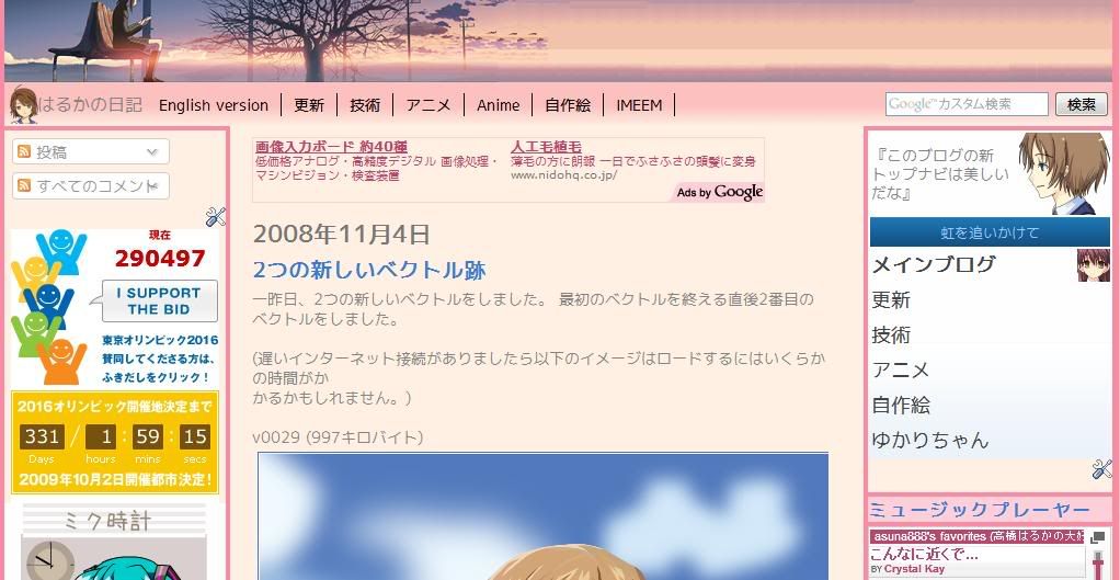
I have redone the top navigation bar of the Japanese-language version of my main blog a while ago. Even though it looks complete, I still need to check for alignment problems on Trident and WebKit-based browsers. Speaking of Trident-based browsers, I won't be fixing problems that only appears in IE6 as that is, by today's standards, outdated.
As the links in the new navigation menu are carried over from the earlier version, I need to remove some codes (eg. background image) in order to fit in nicely. Currently, the links are aligned towards the left. I want it to be at the center. The search box has been moved from the other navigation menu and on to the new one.
I'm thinking of applying this to the English-language version too, but seeing that I am going to change the current autumn theme to winter somewhere between the end of this month and the beginning of the next, maybe later.
skip to main |
skip to sidebar
List of updates to my profile and blogs.


